
Shinola Detroit
Utilizing UX Research to implement design solutions.
Overview
Shinola stands as a prominent brand renowned for its diverse range of luxury products, including statement watches, leather goods, and jewelry. Headquartered in Detroit, Michigan, Shinola is a fixture around the city and throughout the country.
Shinola’s website needed freshening up as well as research into what was inhibiting users from purchasing. Luxury purchases are big decisions for most people but the real challenge here was understanding the pain points during the add-to-cart process and helping to build back some trust with Shinola’s users.
Task
Increase add-to-cart conversion and completion rates
Role
UX Researcher and Designer
Timeline
6 Weeks
Tools
Figma, Adobe XD, Dovetail, Google Analytics, AB Tasty
Empathize
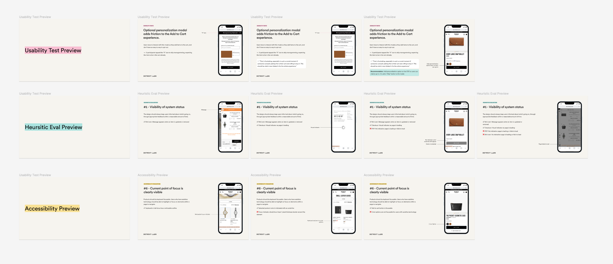
Heuristic Evaluation
We began with a heuristic evaluation of the Shinola website. This helped to inform where pain points were likely occurring to cause the drop off in Add to Cart conversions. We used the 10 Usability Heuristics for User Interface Design compiled by the Nielsen Norman Group to conduct our evaluation.
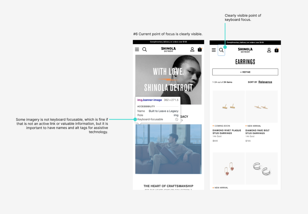
Accessibility Audit
We then conducted an accessibility audit to ensure that the design combined visual elements with functionality to create the overall user experience. These recommendations follow the WCAG 2.2 AA Standards for web accessibility.
Usability “hallway” tests
Next, we conducted usability tests on the existing mobile version of the Shinola website.
We started by brainstorming the research themes that would help inform what tasks we would have our participants complete.
We called these usability tests “hallway tests” because we had a tight deadline and limited budget. We sourced participants from our agency office with varying levels of familiarity with the Shinola brand and previous purchase experiences. We knew that even with the limitations of hallway testing, we could uncover 85% of usability problems by conducting at least 5 user interviews.


Research objectives
Primary goal
Evaluate the usability of Shinola’s mobile website, from Find/Browse to Add to Cart. We will pay special attention to:
Product Detail Page (PDP)
PDP-to-Cart experience
Storytelling throughout the site
Non-goals
Although important, this research will not focus on:
Omnichannel experience: the touchpoints a customer experiences outside of the website, such as retargeting emails
On the PDP, selecting sets of complementary products
On the PDP, customizing a watch
The checkout-to-confirmation experience, including choosing a payment method, gifting choices, and error messages
Methodology
We conducted 1-hour sessions with 10 participants.
Our participant pool contained a mixture of Shinola customers and non-customers.
Each session was comprised of two parts:
Interview Questions
Most recent Shinola purchase, or most recent investment purchase
Role of scale, reviews, and storytelling in their purchase habits
Usability Test
1-3 tasks, mapping journey from locating product to adding to cart. (Checkout was out-of-scope.)
Tasks were either locating a specific product (slim bifold wallet), a category of product (a necklace of some kind) or browsing for a recommended item (which participants could interpret however they’d like).
Outcome
Presentation of patterns, findings, and recommendations, which can inform future design work and feature prioritization.
Where possible, recommendations should impact two key areas: overall site conversion and the Add to Cart rate.
Define & Ideate
Upon completion of our usability testing and synthesizing, we were able to compile a list of recommendations. We then prioritized the top 5 recommendations that would have a high impact and relatively low design/development effort. We did this because of our budget and time constraints.
Recommendations
Add a loading indicator (and error message, if the Mini Cart fails to load) whenever possible.
Adjust the accordion component so that content sits below the accordion header; enable each to open and close independently.
Explicitly call out that monogramming is complimentary. Change or remove “$0”.
Adjust the focus indicator on product options to follow WCAG 2.1 standards of a 1-pixel border around the selected object.
Format the shipping notification to meet WCAG 2.1 contrast ratio standards.
We did provide the full list of 43 additional recommendations to Shinola. We prioritized each recommendation based on high or low impact and high or low design/development effort.
Additionally, we captured future considerations that Shinola could implement once we handed off the project.

Prototype & Test
We began to implement the prioritized recommendations and began to work through the client review and approval process.


Once we had approval on designs and wireframes, we moved into the second phase of testing. We conducted A/B Testing using a program called AB Tasty. We ran our 2 A/B tests for 3 weeks, which was less than we had recommended but was within our tight timeline and we were able to see the initial results of our improved designs and how users engaged with the new content.

A/B Testing Results
Through design work, impacted the usability and overall quality of Shinola.com, particularly on one of its most crucial pages: the product detail page.
A/B test #1 successfully demonstrated the impact of reducing friction in the “Add to Cart” flow by adjusting the personalization experience. (a “quick win”)
$25K increase in revenue
11.5% increase in conversion
9.98% increase in checkout conversion
A/B test #2 successfully demonstrated the impact of making it easier for users to locate important product details. (a “quick win”)
$33K increase in revenue
4.7% increase in conversion
1.14% increase in checkout conversion
Reflection & Next steps
This project was a lot of fun. It was a great experience working with such an iconic Detroit brand. Shinola has a long history and deep roots in Detroit and helping them to achieve a better user experience for their customers was very special to me. We knew with the timeline and budget that we could deliver quick wins and I hope to have the privilege of working with Shinola again someday.
Design Handoff
The prototype and wireframes along with future design considerations were handed off to the staff UX/UI designer.