
DTE Energy Outage Center
Redesigning the reporting experience
Overview
DTE Energy’s mobile app helps more than 2 million customers manage their electric and gas service. As part of Detroit Labs’ mobile team, I worked on improving the Outage Center, specifically designing the reporting flow for power line issues on iOS and Android.
The goal was to make it easier for customers to report downed power lines or damaged equipment safely and accurately which reduces call center volume while improving user confidence and safety.
Task
Redesign the Outage Center to make reporting downed power lines easier
Role
Lead UX/UI Designer
Timeline
8 Weeks
Tools
Figma, Zeplin, Miro
Empathize
Before I joined, DTE’s internal design team had conducted foundational research and established a design system for the web application. Our mobile team at Detroit Labs was tasked with translating those designs and user flows to native mobile platforms.
To better understand user pain points, I reviewed prior research summaries and app store feedback and discussed common issues with our delivery lead and developers. Early insights revealed that customers struggled to identify where to report a power line issue and weren’t sure what happened after submitting a report.

User Personas
I also created 3 user personas to more clearly identify user pain points and understand what their motivations might be when using the DTE Energy mobile app.

The Safety-Concerned Homeowner
Maria Thompson, 42
Location
Detroit suburb
About
Maria works full-time, has two kids, and manages most household utilities. She’s cautious about safety and relies on the DTE app during storms or outages to stay informed. She uses her phone frequently but doesn’t like complicated interfaces.
Goals
Report dangerous issues quickly and safely
Understand whether DTE received her report
Keep her family safe during outages or downed lines
Pain Points
Unsure which issue type to select when something “looks dangerous”
Confused by technical language
Wants clear confirmation and next-step instructions
Tech Comfort
Moderately comfortable; prefers simple, guided flows.

The On-the-Go Commuter
Darius Greene, 29
Location
Downtown Detroit
About
Darius often notices issues on his commute—flashing street equipment, sagging lines, or debris after storms. He uses the mobile app only when necessary and needs fast, frictionless interactions.
Goals
Report issues quickly without navigating deep menus
Use location detection instead of manual entry
Trust that reporting actually triggers action
Pain Points
Slow or multi-step processes feel frustrating
Hard to report when unclear what qualifies as a power line hazard
Minimal feedback after submitting a report
Tech Comfort
High; expects intuitive interactions and modern patterns

The Elderly Resident
Walter Jenkins, 67
Location
Ann Arbor
About
Walter lives alone and depends on reliable power. He uses the DTE mobile app mainly during outages. He prefers clear, readable text and step-by-step guidance to avoid mistakes.
Goals
Understand when to report a problem vs. wait for restoration
Feel confident he selected the right issue type
Follow clear safety instructions
Pain Points
Technical terminology is confusing
Small icons or complex screens feel overwhelming
Unsure what happens after submitting a report
Tech Comfort
Low-to-moderate; benefits from clarity, simplicity, and reassurance
Define & Ideate
Key challenges identified:
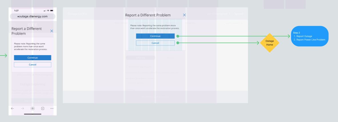
The “Report a problem” entry point was buried within multiple menus.
Terminology like “hazardous condition” confused users.
Users lacked feedback or reassurance after submitting a report.
Design challenge
How might we streamline the reporting flow so users can confidently report a power line issue while staying informed and safe?
I explored design approaches that simplified the experience while maintaining safety compliance. Ideas included:
Replacing technical terms with clear, action-based language.
Creating a guided step-by-step flow with visual cues for issue types.
Integrating location auto-detection and optional photo upload.
Adding safety warnings and confirmation states that reinforce safe behavior.
I collaborated closely with DTE’s internal designer to ensure consistency with their web patterns while adapting layouts and interactions to follow iOS and Android best practices.

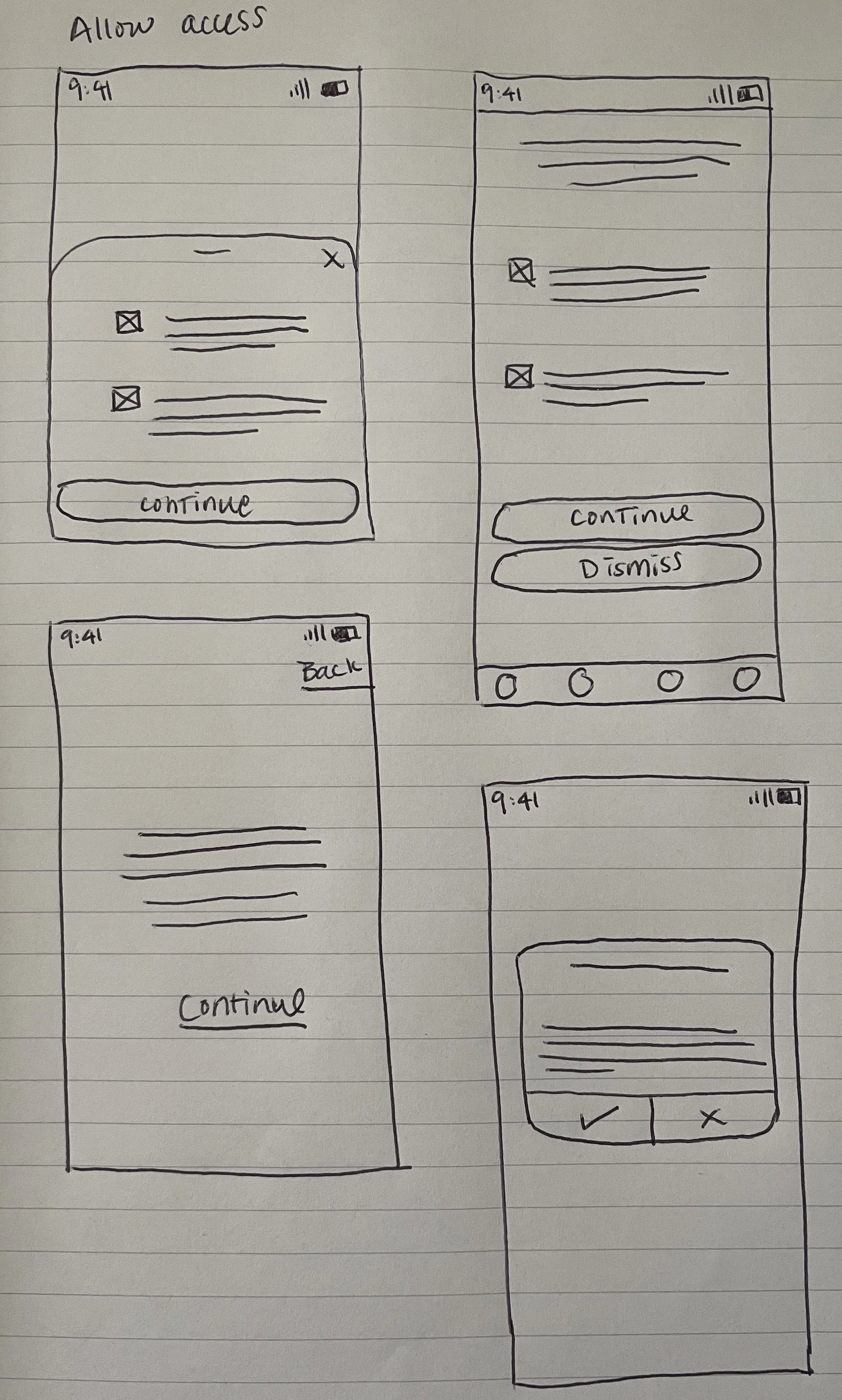
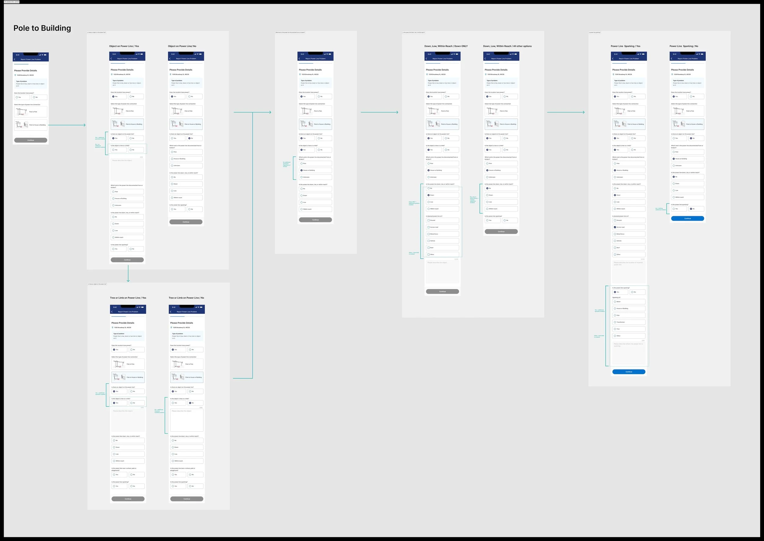
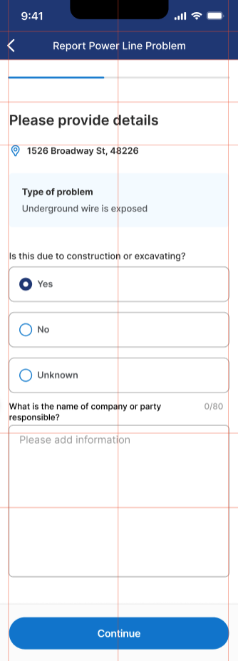
Prototype & Test
I designed the updated reporting flow in Figma and collaborated with developers to ensure feasibility across both mobile platforms.
The flow featured:
Select an issue type (with descriptive icons and examples)
Confirm or adjust the location using GPS or manual entry
Submit and review confirmation, which included safety instructions and clear next steps (“Stay at least 25 feet away from power lines”)

We conducted hallway usability tests with five Detroit Labs employees, following the principle that testing with five users can uncover roughly 85% of usability issues.
Results
All participants completed the flow successfully without assistance.
Users found the new language clearer and the flow easier to navigate.
The confirmation screen provided a stronger sense of completion and safety awareness.
Feedback from the development team also confirmed that the design translated smoothly to both platforms.

Reflection & Next steps
This project reinforced the value of designing within established systems while still finding room for improvement in clarity and confidence.
Next steps
Future enhancements could include adding real-time report tracking or integrating with outage maps to keep users informed of DTE’s response.